The PlayStation logo history tells us the story of an iconic game franchise that has a memorable logo that is stuck in the head of any kid from the 1990s. Popularly known as “PS” (PlayStation), and also holds the record for the best-selling gaming console ever in the world.
PlayStation logo history
The iconic PlayStation logo made its debut appearance in 1994 when it was released alongside the original console, ‘PlayStation One’. Designed by Japanese renowned designer-Manabu Sakamoto, who has also created other iconic Sony logos like the Sony Vaio.

Amongst the officially chosen Playstation logo, which is still used to this date, are 20 other logo concepts that were proposed by the designer Manabu Sakamoto.
Manabu Sakamoto created quite a large number of other logo concepts for the PlayStation logo (20 in total) that weren’t always talked about, probably because of how successful the accepted logo has been.
The designer pulled off the Playstation logo design by incorporating the three-dimensional gameplay graphic properties of the PlayStation system into the PlayStation emblem.
Clearly, we can see how the ‘P’ stands upright above the “S,” giving an optical illusion of a 3D graphic style appearance of having width, height, and depth. The “S” seems to appear like the shadow of the ‘P’ creating more contrast between the two letters.
Manabu Sakamoto was able to achieve his goal by creating this icon, the logo was adopted, and henceforth, it became Sony PlayStation’s official trademark.
The PlayStation logo history is an interesting inspiration for a brand identity, which reminds us of how a brand should retain its identity through time regardless of how many major or minor changes occur.
Another good example that matches the PlayStation logo history in terms of its timeless trademark is the Coca-Cola logo. Despite how many visual changes occur in the visual identity, it is still recognized.
Playstation Font
Pairing the PlayStation logo with its own personalized font was a smart idea the designer had, the font was seen as a significant part of the overall appearance of the PlayStation brand identity.
Manabu Sakamoto added a custom logo to the project with the aim of matching the logo and giving it a coherent look and finishing touch with the icon. The fonts are made with strict, thin lines running through the various letters and smooth curves around letters like “a”, “o,” and partly “n,” so they achieve a minimalistic look.
However, major emphasis is placed on the starting letters “P” and “S,” creating vivid contrast with the rest of the other letters.
Playstation Color
The PlayStation logo has a total of four bright colors in its color scheme: red, yellow, green, and Blue. The green has a little adjustment of the tint to achieve harmony with the rest of the other bright colors.
These colors were brilliantly chosen by the designer. When asked why he chose those colors, he said he chose them because they are a set of simple, bright colors that anyone could easily understand, especially children.
This color represents joy, passion, and excellence. Which is what Playstation and its brand strongly uphold.
PlayStation logo evolution
1999-2000 (PlayStation 1)
The PlayStation logo history has made little to no significant changes that we can identify. However, the PlayStation logo, since its release in 1994, has maintained a particular identity until 2009, when a few adjustments were made to the logo.
The original PlayStation icon, which was released in 1994, was indeed a memorable icon that still maintains its reputation to this day. It has the letters “P” and “S,” which originally consisted of the three primary colors (red, blue, and yellow), but the inclusion of green made for a livelier and more vibrant design.
The letter “P” stands upright just in front of the letter “S” which has a bright red color. While the letter “S” lays horizontally flat, acting like a shadow from the “P.” The vivid color contrast of the Playstation logo gives it a catchy appearance that makes it stand out from the white background.
Although the PlayStation logo history and evolution prevailed through the years, there were subtle changes that never really made a big difference to the iconic trademark.
2000 (PlayStation 2)
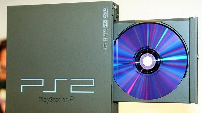
After the first PlayStation console, the second installment of the PlayStation console listing was introduced in the year 2000, the PlayStation 2. The Sony PlayStation 2 product was a massive hit, as it holds the record for the best-selling game console ever in the world.
The PlayStation came with a brand new logo, which was in the form of a simple monogram written vividly, “PS2”. The logo went with a simple geometric font with sharp edges and also had a gradient effect transition from blue to white that gave it a unique look.
If you ask me, the logo was simple in its appearance, making it the only logo that stood out from the rest in the PlayStation logo history.
Have you noticed that all through the PlayStation logo history, the Playstation 2 is the only logo that depicts the sharp edges of the PlayStation 2 console? They also incorporated the CD-ROM reflection to be the gradient color on the PlayStation logo.
I’m just voicing my thoughts. So, what do you think? Drop a comment in the comment section.
2006 (PlayStation 3)

The PlayStation 3 was released in 2006 with significant upgrades in gameplay graphics and other exciting features. At most, thanks to its release, which brought us a brand new Grand Theft Auto 5 game after a long wait.
The ps3 logo actually came in two variants. The old logo which was released with the first released PlayStation 3 model, had so much controversy surrounding it. Rumour has it that the ps3 logo was a copycat version of the Spider-Man logo.

Anyway, the PlayStation 3 came with a revamped logo that wasn’t too distinguished from its earliest ancestor. The PlayStation 3 logo had a smoothly curved text that held the console name inscribed “PS3,” but this time, Sony decided to ditch their colorful color palette and instead go for a monochromatic color style.
The reason is to cut down on the cost of color production during logo printing. Instead, they adopted a monochrome color model for their logo. This means they need no color anymore during logo production, allowing the logo to be easily placed on any surface or material.
2014 (PlayStation 4)

The fourth console was released in November 2014, having the same appearance as the previously released console.
The PlayStation 4 logo consists of a variation of slim lines that outline the console name and the “4” symbol in front, which represents the console generation. The smoothly curved corners, which can be seen on the “P” and “S,” give it a soothing feel.
On the left-hand side next to the PS4 symbol is the iconic PlayStation symbol in simple monochrome color with a contour effect running upward through the letter “P.”
2020 (PlayStation 4)

The long-awaited logo in the PlayStation logo evolution, ladies and gentlemen, is the “PlayStation 5”. Throughout the PlayStation logo history, there has never been a highly anticipated and controversial logo like the PlayStation 5.
Released in November 2020, the PlayStation welcomed us with so many exciting gameplay graphics and features, but unfortunately, the logo remained the same once more.
The logo is simply a replica of the PlayStation 4 logo. Well, it’s a good thing when you view it through the lens of a brand maintaining its brand icon. However, fans took it upon themselves to do justice to the PlayStation 5 logo.
We saw this idea for the logo from an artist in one of the creative communities who thought if we should expect a new logo for the PlayStation 5, it should somehow look close to the logo above.
Sony must be impressed with the logo idea, but they thought it would be better to keep the PlayStation history and branding brand trademark going even after 29 years. Instead of adopting a new logo for the PlayStation 5, they simply changed the number.
What do you think about the PlayStation logo evolution? Has PlayStation done great by keeping the company’s logo intact from 1994 till 2023 or are they been too rigid with their never changing visual identity?
Or, is it a difficult graphic design task for designers to pull off and propose to Sony PlayStation a new logo for them to adopt?
Interesting Fun Facts about the Sony PlayStation Brand
Sony had a game console prototype with Nintendo

Within the PlayStation logo history, Sony PlayStation had a prototype that was made in the 90s in collaboration with the leading gaming company Nintendo. The project was abandoned due to the dispute PlayStation had with Nintendo due to the unfair sharing of profit the gaming console will generate.
The prototype was named the Super NES Rom but players preferred naming it “Nintendo PlayStation”. Fortunately, the Nintendo PlayStation auction was up and a lucky retro gaming enthusiast was willing to buy it for some thousands of dollars.
Sony Bravia Tv with inbuilt “PlayStation 2”

Along the line of PlayStation logo history was a gaming tv. In 2010, Sony released a 22-inch Sony BRAVIA KDL22PX300 tv that has PlayStation 2 gaming system incorporated inside which allowed gamers to enjoy gaming right from their tv set.
The tv came along with a set of cool features like allowing players to simuatenously play and see their gameplay on a separate screen during gameplay with the help of 3D glasses.
PlayStation controller buttons have meanings

The design of the buttons on the PlayStation controller wasn’t made arbitrarily. They were made with deliberate intent. Infact when asked, the designer-Sony Teiyu said
“Other game companies at the time assigned alphabet letters or colors to the buttons. We wanted something simple to remember, which is why we went with icons or symbols, and I came up with the triangle-circle-X-square combination immediately afterward. I gave each symbol a meaning and a color. The Triangle refers to viewpoint; I had it represent one’s head or direction and made it green. Square refers to a piece of paper; I had it represent menus or documents and made it pink. The Circle and X represent ‘yes’ or ‘no’ decision-making and I made them red and blue respectively. People thought those colors were mixed up, and I had to reinforce to management that that’s what I wanted”.